Showing posts with label User Interface. Show all posts

Thursday, August 22, 2013

Google Tests a New Mobile Search Interface

Google tests a new card-style interface for mobile search results. There are special cards for Knowledge Graph results, results from specialized search engines and for related searches. The new interface only shows Previous/Next buttons.


Many Google web apps and mobile apps use the card-style interface that was first added to Google Now. You can find it in Google Search, Google Play, Google+, the new Google Maps, Google Keep, the new YouTube app. "A lot of use of white space, not a lot of artificial, surface-like divisions. We're really counting on bold typography, white space, and big images to give emphasis, give character and give hierarchy to the cards that we give you," said Matias Duarte, who leads the Android User Experience team.

{ Thanks, Nedas. }

Wednesday, August 21, 2013

Try the New Google Search Interface in Chrome 29

If you enable "Instant Extended API" in the recently released Chrome 29, you also get a new Google Search interface that hides the search box, has a new navigation menu and a new share button. This also enables the updated new tab page which is actually a simplified Google homepage.


To try the experimental new tab page and the new Google interface, paste this in Chrome's address bar: chrome://flags/, use Ctrl+F to search for "Enable Instant Extended API" and click "Enabled" in the drop-down below "Enable Instant Extended API". Then click "Relaunch now" at the bottom of the page to restart Chrome. To disable this feature, use the same instructions, but click "Disabled" instead of "Enabled".

Tuesday, August 20, 2013

YouTube Tests Sticky Header

Google tests an oversized sticky header. It's a lot bigger than the existing header and it has a fixed position, so you can quickly use the search box, upload videos or open a playlist even when you scroll down.


Unfortunately, it's way too big:


YouTube also experiments with relocating the share button next to the like/dislike buttons and adding sharing buttons for Facebook, Twitter and Google+.

How to enable these experiments? If you use Chrome, Firefox, Opera, Safari or Internet Explorer 8+:

1. open youtube.com in a new tab

2. load your browser's developer console:

* Chrome or Opera 15+ - press Ctrl+Shift+J for Windows/Linux/ChromeOS or Command-Option-J for Mac

* Firefox - press Ctrl+Shift+K for Windows/Linux or Command-Option-K for Mac

* Opera 12 - press Ctrl+Shift+I for Windows/Linux or Command-Option-I for Mac, then click "Console"

* Safari - check this article

* Internet Explorer - press F12 and select the "Console" tab.

3. paste the following code which changes a YouTube cookie:

document.cookie="VISITOR_INFO1_LIVE=JX5TVkqGL3I; path=/; domain=.youtube.com";window.location.reload();

4. press Enter and close the console.

To go back to the regular interface, use the same instructions, but replace the code from step 3 with this one:

document.cookie="VISITOR_INFO1_LIVE=; path=/; domain=.youtube.com";window.location.reload();

In other related news, the channel cards seem to be publicly available.

{ via Techno-Net }

Sunday, August 18, 2013

Result Details - a Google Search Experiment

There's a new Google experiment that annotates search results with information about the sites. Most of the information is obtained from Wikipedia articles, but there are a few exceptions.

Here are some examples. Click "Wired (magazine)" next to the search result URL and you'll read an excerpt from the Wikipedia article about Wired. Google also shows if the site is a Webby Award winner.


If you click the similar link placed next to the Google Voice blog, you can read some old information about GrandCentral, which was acquired by Google in 2007. The information is not obtained from a Wikipedia article.


The panels that show result details are quite useful and help you find more information about a site before visiting it. Unfortunately, the site needs to have a Wikipedia article, but that will probably change if the experiment becomes a standard feature.

Google's algorithms that associate pages with entities and Wikipedia articles are not perfect. The result details for google.ca are really funny:


To try this experiment, install a cookie manager extension like "Edit This Cookie" for Chrome, go to google.com and change the value of the NID cookie to:

67=p2QqiMkeBvGpTUoMlME_QMwGVE9LaS3h9FlO1p0kyVOCg9NVW8uNwAKALJalAfhHJweQdt7KDWjpv6P_1vsE-EGlABKpxK8PRUbwwQm2QBm9rZ3rARFBz6lCKcp2KF_x


If you use "Edit This Cookie", don't forget to click "Submit changes". Delete the NID cookie to opt-out from the experiment.

{ via Techno-Net }

Saturday, August 17, 2013

A YouTube Experiment Removes Ads

Update (August 23): this no longer works.

YouTube's experiments add new features or tweak the interface. Here's an experiment that does something unexpected: it removes the ads. After changing your cookie, you'll no longer see ads on the homepage, in search results, next to YouTube videos. The experiment also adds channel cards when you mouse over YouTube channel links.

This screenshot shows an ad at the top of my YouTube homepage:


When enabling this experiment, the ad disappears:


This also works for the in-stream video ads and the Homepage Roadblock ads. It's not clear why YouTube added this experiment. Maybe they want to see how people use the site if there are no ads.


How to enable the experiment? If you use Chrome, Firefox, Opera, Safari or Internet Explorer 8+:

1. open youtube.com in a new tab

2. load your browser's developer console:

* Chrome or Opera 15+ - press Ctrl+Shift+J for Windows/Linux/ChromeOS or Command-Option-J for Mac

* Firefox - press Ctrl+Shift+K for Windows/Linux or Command-Option-K for Mac

* Opera 12 - press Ctrl+Shift+I for Windows/Linux or Command-Option-I for Mac, then click "Console"

* Safari - check this article

* Internet Explorer - press F12 and select the "Console" tab.

3. paste the following code which changes a YouTube cookie:

document.cookie="VISITOR_INFO1_LIVE=oKckVSqvaGw; path=/; domain=.youtube.com";window.location.reload();

4. press Enter and close the console.

To go back to the regular interface, use the same instructions, but replace the code from step 3 with this one:

document.cookie="VISITOR_INFO1_LIVE=; path=/; domain=.youtube.com";window.location.reload();

Obviously, there are many ways to hide or remove ads, so if you want to do that, there are better options than relying on an experiment that might no longer work at some point.

{ via Techno-Net }

Google Tests Desktop Sub-sitelinks

A few months ago, Google's mobile search site tested sub-sitelinks. "The links shown below some of Google's search results, called sitelinks, are meant to help users navigate your site. Our systems analyze the link structure of your site to find shortcuts that will save users time and allow them to quickly find the information they're looking for," explains Google. The expandable sub-sitelinks go deeper and send users to some popular subsections of a site.

The same sub-sitelinks are now tested by Google's desktop search interface. Sub-sitelinks are only displayed for navigational results. The experiment makes the top result a lot more prominent and shows snippets and arrows next to the regular sitelinks. The homepage title is bigger and Google uses the card layout.


Click the arrows to see the sub-sitelinks.


Here's a video:


To try this experiment, install a cookie manager extension like "Edit This Cookie" for Chrome, go to google.com and change the value of the NID cookie to:

67=bmHw1iFJSvWl2_5KKxRfyyqHcge-1Ki-6j033efhbbojYKHEFKmAUPx-XYe2dHQi0a8mu_CqdbVH5ir0J4ZNKv7QXl_uftc7XY7Mx5UXge1RRKNpmH6Q-q9v-gfYfsbZ


If you use "Edit This Cookie", don't forget to click "Submit changes". Delete the NID cookie to opt-out from the experiment.

{ via Techno-Net }

Friday, August 16, 2013

YouTube Tests New Music Cards

YouTube experiments with a new format for the music artist box. Now it looks more like the Google Knowledge Graph card, it has more pictures, more songs, a list of related artists and a list of albums. Click an album and you'll start a playlist with all the songs from the album. Click a song and you can listen to all the other songs from the artist's playlist. Who needs Google Play Music All Access when you have YouTube?


Here's the existing layout:


There's also a new YouTube Mix interface that looks more like Google Music's radio feature. It's still a playlist, but it no longer shows numbers, there's an "up next" section, a "next video" button and the end of the list has a fading effect which suggests that there are other songs, but they're not yet displayed.


Here's the existing YouTube Mix:


How to enable the experiment? If you use Chrome, Firefox, Opera, Safari or Internet Explorer 8+:

1. open youtube.com in a new tab

2. load your browser's developer console:

* Chrome or Opera 15+ - press Ctrl+Shift+J for Windows/Linux/ChromeOS or Command-Option-J for Mac

* Firefox - press Ctrl+Shift+K for Windows/Linux or Command-Option-K for Mac

* Opera 12 - press Ctrl+Shift+I for Windows/Linux or Command-Option-I for Mac, then click "Console"

* Safari - check this article

* Internet Explorer - press F12 and select the "Console" tab.

3. paste the following code which changes a YouTube cookie:

document.cookie="VISITOR_INFO1_LIVE=CvMBBZAh_fw; path=/; domain=.youtube.com";window.location.reload();

4. press Enter and close the console.

To go back to the regular interface, use the same instructions, but replace the code from step 3 with this one:

document.cookie="VISITOR_INFO1_LIVE=; path=/; domain=.youtube.com";window.location.reload();

{ Thanks, Yu-Hsuan Lin. }

YouTube's AJAX Interface, Live in Chrome

YouTube's AJAX interface seems to be publicly available, at least for Chrome users. Back in May, I noticed a red progress bar at the top of YouTube's pages when loading a new video: YouTube experimented with the HTML5 history.pushState to change the browser URL without reloading the page. Then YouTube's engineers detailed their plan to make YouTube pages load faster. In the new interface, the video player and the JavaScript/CSS files are only loaded once, so when you click a new link, YouTube only loads the HTML page and the video. This happens almost instantly.


For some reason, the AJAX interface currently launched by YouTube only works when you click a related video or when you load a playlist. It doesn't work yet for the homepage and search results.

Wednesday, August 14, 2013

YouTube's New Playlist Player

YouTube has a new interface for embedded playlists. Most people only embed videos, but you can also embed playlists.

The updated player has 2 buttons that show the playlist videos overlaid on top of the currently playing video. You can only scroll using the player's scrollbar, there's no support for keyboard shortcuts or mouse wheels. Click one of the videos from the list and the player still displays the list: you need to click one of the 2 playlist buttons to hide the list.

The playlist player has a "play all" button (don't click, it's just a screenshot).


Here's a YouTube playlist that shows how to use the new Google Maps:


The old playlist player displayed some thumbnails at the bottom of the video, so you could still see what's playing. It worked well for playlists with a few videos. The new player is better suited for playlists with many videos.

Licensed as Creative Commons Attribution-NonCommercial-ShareAlike by Steve Garfield.

{ Thanks, Michel. }

Tuesday, August 13, 2013

The Old Gmail Compose Interface, No Longer Available

If you're still using Gmail's old compose interface, you should switch to the new interface. In a few days, the old compose UI will no longer be available, so it's a good idea to learn more about the new UI and try to adapt.


The new compose box has been launched in October 2012, so it's not that new anymore. Google added some new features since then: inserting emoticons and event invitations, adding labels to outgoing messages and a full-screen mode you can set as default. The full-screen mode is closer to the old interface and it's consistent with the mobile interface.


"A few weeks ago we added a full-screen option to the new compose. Now that that option is available, we're saying farewell to the old compose and switching everyone to the new compose over the next few days. The new compose opens drafts as a minimizable window so you can write multiple drafts at once, keep an eye on incoming email, adds support for inline images and much more. If you prefer a full-screen compose experience, you can click on the expand button in the top right of the new compose window to switch to full-screen and then set it as the default by selecting Default to full-screen in the more options menu in the bottom right," explains Google.

I'm sure that a lot of people will complain and say that the old interface is better. I've used the new compose box ever since it was released and I think it's great. You can use other Gmail features while composing a message, you can write multiple messages and there aren't many links and buttons that get in the way. I've briefly switched to the old compose experience and I was surprised to see how cluttered it was: "add cc", "add bcc", "insert invitation", "check spelling", a lot of rich-text editing buttons. It looked like a document editor, not like a communication software. This quote sums up everything that's importat about the new compose layout: "You can now write messages in a cleaner, simpler experience that puts the focus on your message itself, not all the features around it."

Sunday, August 11, 2013

YouTube Tests Unified Settings Control

YouTube tests a new version of the video player with a unified control for annotations, size, video quality and more.


I don't think it's a good idea to combine these settings because they become more difficult to find. Some player buttons show up only if they're useful (for example, the annotation button) and they let you disable feature with a single click. The unified control requires more clicks and doesn't show useful information at a glance.

{ Thanks, Yu-Hsuan Lin. }

Friday, August 9, 2013

Changes to Chrome's New Tab Page

You might remember the experimental new tab page that has been tested by the Chrome team for many months. The new tab page will be replaced by a simplified version of the Google homepage, most of the features of the new tab page will be relocated, while the search box will be removed from the Google Search interface and replaced by the Chrome omnibox.

The latest Dev Channel/Canary releases show this box with information about the new tab page: "Changes to the New Tab page".

* Get the Google Doodle and other features of Google.com on any new tab you open.
* Use the Chrome menu to get your recently closed tabs from any site you're on.
* Access your Apps by clicking on the Chrome App Launcher icon in your Windows Taskbar or the Apps icon in the bookmarks bar.


It looks like the updated new tab page will be released in the near future and it will bring a lot of other changes: Chrome's app launcher, more packaged apps, a new Google Search interface without the search box and a new navigation interface for Google that uses the app launcher menu.

The 8 empty boxes from this screenshot are used to display the most visited pages. It's the only feature from the old NTP that has been preserved. There's an apps icon in the bookmarks bar that links to a page that displays your apps, while the recently closed tabs and the tabs from other devices are displayed in the Chrome menu, below the bookmarks.


Here's the special google.com interface for Chrome:


To try the experimental new tab page, paste this in Chrome's address bar: chrome://flags/, use Ctrl+F to search for "Enable Instant Extended API" and click "Enabled" in the drop-down below "Enable Instant Extended API". Then click "Relaunch now" at the bottom of the page to restart Chrome. To disable this feature, use the same instructions, but click "Disabled" instead of "Enabled".


{ Thanks, Yu-Hsuan Lin. }

Wednesday, August 7, 2013

ActionBarCompat and I/O 2013 App Source

Posted by Chris Banes, Android Developer Relations


Following on the Android 4.3 and Nexus 7 announcements, we recently released two important tools to help you build beautiful apps that follow Android Design best practices:


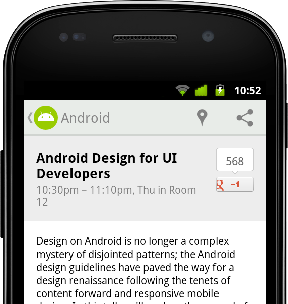
  • We released a new backward-compatible Action Bar implementation called ActionBarCompat that's part of the Support Library r18. The ActionBarCompat APIs let you build the essential Action Bar design pattern into your app, with broad compatibility back to Android 2.1.


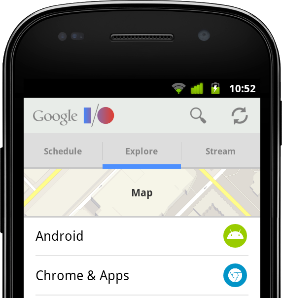
  • We released the full source code for the I/O 2013 app, which gives you working examples of ActionBarCompat, responsive design for phones and tablets, Google+ sign-in, synchronized data kept fresh through Google Cloud Messaging, livestreaming using the YouTube Android Player API, Google Maps API v2, and much more.
    All of the app code and resources are available for you to browse or download, and it's all licensed under Apache License 2.0/Creative Commons 3.0 BY so you can reuse it in your apps. You can get the source at code.google.com/p/iosched


This post helps you get started with ActionBarCompat, from setting up the Support Library to adding an Action Bar to your UI. If you want to see ActionBarCompat in action first, download the I/O 2013 app from Google Play and give it a try. The app's Action Bar is built using the ActionBarCompat and served as our main test environment for making sure the APIs work properly, with full compatibility across platform versions.


Getting Started with ActionBarCompat


ActionBarCompat is a new API in the Android Support Library that allows you to add an Action Bar to applications targeting minSdkVersion 7 or greater. The API and integration have been designed to closely mirror the existing framework APIs, giving you an easy migration path for your existing apps.


If you've already using another implementation of Action Bar in your app, you can choose whether to ActionBarCompat. If you’re using the old ActionBarCompat sample available through the SDK, then we highly recommend that you upgrade to the new ActionBarCompat API in the Support Library. If you’re using a third-party solution (such as ActionBarSherlock), there are a few reasons to consider upgrading:


ActionBarSherlock is a solid and well-tested library which has served
developers very well for a long time. If you are already using it and do not
currently require any of the above then there is no need to migrate.


If you are ready to get started with ActionBarCompat, the sections below take you through the process.


1. Add ActionBarCompat as a project dependency


ActionBarCompat is distributed as both a Gradle artifact and a library project. See Setting Up the Support Library for more information.


2. Update your style resources


The first thing to update are your Activity themes so they use a Theme.AppCompat theme. If you're currently using one of the Theme.Holo themes then just replace this with the related Theme.AppCompat theme. For instance if you have the following in your AndroidManifest.xml:


<activity
...
android:theme="@android:style/Theme.Holo" />


You would change it to:


<activity
...
android:theme="@style/Theme.AppCompat" />


Things get more tricky when you have a customized theme. The first thing to do is change your base theme to one of the Theme.AppCompat themes, like above.


If you have customized styles for the Action Bar (and related widgets) then you must also change these styles to extend from the Widget.AppCompat version. You also need to double-set each attribute: once in the Android namespace and again with no namespace (the default namespace).


For example, in the following example we have a custom theme which extends from Theme.Holo.Light, which references a custom Action Bar style.


<style name="Theme.Styled" parent="@android:style/Theme.Holo.Light">
<item name="android:actionBarStyle">@style/Widget.Styled.ActionBar</item>
</style>

<style name="Widget.Styled.ActionBar"
parent="@android:style/Widget.Holo.Light.ActionBar">
<item name="android:background">@drawable/ab_custom_solid_styled</item>
<item name="android:backgroundStacked"
>@drawable/ab_custom_stacked_solid_styled</item>
<item name="android:backgroundSplit"
>@drawable/ab_custom_bottom_solid_styled</item>
</style>


To make this work with AppCompat you would move the above styles into the values-v14 folder, modifying each style's parent to be an AppCompat version.


<style name="Theme.Styled" parent="@style/Theme.AppCompat.Light">
<!-- Setting values in the android namespace affects API levels 14+ -->
<item name="android:actionBarStyle">@style/Widget.Styled.ActionBar</item>
</style>

<style name="Widget.Styled.ActionBar" parent="@style/Widget.AppCompat.Light.ActionBar">
<!-- Setting values in the android namespace affects API levels 14+ -->
<item name="android:background">@drawable/ab_custom_solid_styled</item>
<item name="android:backgroundStacked"
>@drawable/ab_custom_stacked_solid_styled</item>
<item name="android:backgroundSplit"
>@drawable/ab_custom_bottom_solid_styled</item>
</style>


You would then need add the following into the values folder:


<style name="Theme.Styled" parent="@style/Theme.AppCompat.Light">
<!-- Setting values in the default namespace affects API levels 7-13 -->
<item name="actionBarStyle">@style/Widget.Styled.ActionBar</item>
</style>

<style name="Widget.Styled.ActionBar" parent="@style/Widget.AppCompat.Light.ActionBar">
<!-- Setting values in the default namespace affects API levels 7-13 -->
<item name="background">@drawable/ab_custom_solid_styled</item>
<item name="backgroundStacked">@drawable/ab_custom_stacked_solid_styled</item>
<item name="backgroundSplit">@drawable/ab_custom_bottom_solid_styled</item>
</style>


3. Modify Menu resources


As with the standard Action Bar in Android 3.0 and later versions, action items are added via the options menu. The difference with ActionBarCompat is that you need to modify your Menu resource files so that any action item attributes come from ActionBarCompat's XML namespace.


In the example below you can see that a new "yourapp" namespace has been added to the menu element, with the showAsAction and actionProviderClass attributes being provided from this namespace. You should also do this for the other action item attributes (actionLayout and actionViewClass) if you use them.


<menu xmlns:yourapp="http://schemas.android.com/apk/res-auto"
xmlns:android="http://schemas.android.com/apk/res/android">

<item
android:id="@+id/menu_share"
android:title="@string/menu_share"
yourapp:actionProviderClass="android.support.v7.widget.ShareActionProvider"
yourapp:showAsAction="always" />
...
</menu>


4. Extend Activity classes from ActionBarCompat


ActionBarCompat contains one Activity class which all of your Activity classes should extend: ActionBarActivity.


This class itself extends from FragmentActivity so you can continue to use Fragments in your application. There is not a ActionBarCompat Fragment class that you need to extend, so you should continue using android.support.v4.Fragment as the base class for your Fragments.


5. Add Menu callbacks


To display items on the Action Bar, you need to populate it by overriding onCreateOptionsMenu() and populating the Menu object. The best way to do this is by inflating a menu resource. If you need to call any MenuItem methods introduced in API level 11 or later, you need to call the shim for that method in MenuItemCompat instead. Here's an example:


@Override
public boolean onCreateOptionsMenu(Menu menu) {
// Inflate the menu
getMenuInflater().inflate(R.menu.main_menu, menu);

// Find the share item
MenuItem shareItem = menu.findItem(R.id.menu_share);

// Need to use MenuItemCompat to retrieve the Action Provider
mActionProvider = (ShareActionProvider)
MenuItemCompat.getActionProvider(shareItem);

return super.onCreateOptionsMenu(menu);
}


6. Retrieve the Action Bar


ActionBarCompat contains it’s own ActionBar class, and to retrieve the Action Bar attached to your activity you call getSupportActionBar(). The API exposed by the compatibility class mirrors that of the framework ActionBar class, allowing you to alter the navigation, show/hide it, and change how it display it’s contents.


7. Add ActionMode callbacks


To start an action mode from your ActionBarActivity simply call startSupportActionMode(), providing a callback similar to how you would with the native action mode. The following example shows how to start an action mode, inflate a menu resource and react to user’s selection:


startSupportActionMode(new ActionMode.Callback() {
@Override
public boolean onCreateActionMode(ActionMode actionMode, Menu menu) {
// Inflate our menu from a resource file
actionMode.getMenuInflater().inflate(R.menu.action_mode_main, menu);

// Return true so that the action mode is shown
return true;
}

@Override
public boolean onPrepareActionMode(ActionMode actionMode, Menu menu) {
// As we do not need to modify the menu before displayed, we return false.
return false;
}

@Override
public boolean onActionItemClicked(ActionMode actionMode, MenuItem menuItem) {
// Similar to menu handling in Activity.onOptionsItemSelected()
switch (menuItem.getItemId()) {
case R.id.menu_remove:
// Some remove functionality
return true;
}

return false;
}

@Override
public void onDestroyActionMode(ActionMode actionMode) {
// Allows you to be notified when the action mode is dismissed
}
});


Similar to the Activity class, ActionBarActivity provides two methods that you can override to be notified when an action mode is started/finished from within your Activity (including attached Fragments). The methods are onSupportActionModeStarted() and onSupportActionModeFinished().


8. Add support for Up navigation


Simple example


Up navigation support is built into ActionBarCompat and is similar to that provided in the Android framework in Android 4.1 and higher.


In the simplest form, you just need add a reference in each AndroidManifest <activity> element to its logical parent activity. This is done by adding a metadata element to the <activity> element. You should also set the android:parentActivityName attribute for explicit Android 4.1 support, although this is not strictly necessary for ActionBarCompat:


<activity android:name=".SampleActivity"
android:parentActivityName=".SampleParentActivity">
<meta-data android:name="android.support.PARENT_ACTIVITY"
android:value=".SampleParentActivity" />
</activity>


In your Activity you should then configure the home button to display for up navigation:


getSupportActionBar().setDisplayHomeAsUpEnabled(true);


When the user now clicks on the home item, the user will navigate up to the parent Activity set in your AndroidManifest.


Advanced calls


There are a number of methods which can be overridden to customize what happens when a user clicks on the home item. Each of the methods below replicate/proxy similarly-named methods added in Android 4.1:


  • onSupportNavigateUp()

  • supportNavigateUpTo(Intent)

  • getSupportParentActivityIntent()

  • supportShouldUpRecreateTask(Intent)

  • onCreateSupportNavigateUpTaskStack(TaskStackBuilder) and onPrepareSupportNavigateUpTaskStack(TaskStackBuilder)


Requesting Window features


When using ActionBarActivity you should call supportRequestWindowFeature() to request window features. For instance the following piece of code requests an overlay action bar:


@Override
protected void onCreate(Bundle savedInstanceState) {
super.onCreate(savedInstanceState);

// Needs to be called before setting the content view
supportRequestWindowFeature(Window.FEATURE_ACTION_BAR_OVERLAY);

// Now set the content view
setContentView(R.layout.activity_main);
...
}


Adding support for ProgressBar


Similar to the native Action Bar, ActionBarCompat supports displaying progress bars on the Action Bar. First you need to request the window feature, you then display or alter the progress bars with one of the following methods, each of which mirror functionality in the similar named method from Activity:


  • setSupportProgress()

  • setSupportProgressBarIndeterminate()

  • setSupportProgressBarVisibility()

  • setSupportProgressBarIndeterminateVisibility()


Below is an example which requests an indeterminate progress bar, and then later displays it:


@Override
protected void onCreate(Bundle savedInstanceState) {
super.onCreate(savedInstanceState);

// Needs to be called before setting the content view
supportRequestWindowFeature(Window.FEATURE_INDETERMINATE_PROGRESS);

// Now set the content view
setContentView(R.layout.activity_main);
...
// When ready, show the indeterminate progress bar
setSupportProgressBarIndeterminateVisibility(true);
}


Further Reading


The Action Bar API Guide covers a lot of what is in this post and much more. Even if you have used the Action Bar API in the past, it’s definitely worth reading to see how ActionBarCompat differs from the framework.


There are also a number of sample applications using ActionBarCompat covering how to use the library in various ways. You can find them in the “Samples for SDK” package in the SDK Manager.


Check out the video below for a quick hands-on with ActionBarCompat.


Sunday, August 4, 2013

YouTube's Channel Card Experiment

There's a new YouTube experiment that shows a channel card when you mouse over the link to a YouTube channel. The card shows the channel's images and description, a link to the Google+ page, a subscribe button, the number of subscribers and sometimes the most recent video from that channel.

This works for search results, comments, suggested videos, homepage videos, recommended channels and more. You can find more about a YouTube channel without having to open a new page.


Sometimes YouTube also shows a list of people from your Google+ circles that subscribed to the channel:


The experiment also includes the "I'm feeling lucky" play button I've mentioned here. This time, it's placed next to the upload button. The play button creates a playlist with recommended videos.


Here's how you can enable the experiment. If you use Chrome, Firefox, Opera, Safari or Internet Explorer 8+:

1. open youtube.com in a new tab

2. load your browser's developer console:

* Chrome/Opera 15 - press Ctrl+Shift+J for Windows/Linux/ChromeOS or Command-Option-J for Mac

* Firefox - press Ctrl+Shift+K for Windows/Linux or Command-Option-K for Mac

* Opera 12 - press Ctrl+Shift+I for Windows/Linux or Command-Option-I for Mac, then click "Console"

* Safari - check this article

* Internet Explorer - press F12 and select the "Console" tab.

3. paste the following code which changes a YouTube cookie:

document.cookie="VISITOR_INFO1_LIVE=0xJL6SMMUyE; path=/; domain=.youtube.com";window.location.reload();

4. press Enter and close the console.

To go back to the regular interface, use the same instructions, but replace the code from step 3 with this one:

document.cookie="VISITOR_INFO1_LIVE=; path=/; domain=.youtube.com";window.location.reload();

{ Thanks, André Zlatin. }

Tuesday, July 30, 2013

Google's New Navigation Interface in a Google+ Screenshot

Remember the new navigation interface tested by Google a few months ago? It replaces the black bar with a new menu similar to Chrome's app launcher.

A screenshot from a Google+ "learn more" page shows a new Google+ interface that uses the app launcher, an updated share button and a new search box without a search button. The screenshot shows the old Google+ notification button, not the Mr. Jingles bell.


{ via Google Plus Daily, spotted by Gabriel Komarnicki. }

Wednesday, July 17, 2013

YouTube Tests Center-Aligned Layout

Nedas Petravičius spotted a new YouTube experiment that changes the user interface: there's a bigger sidebar that's now overlaid, the Dashboard/Video Manager/Analytics menu has been moved to the right corner of the page and the Upload button is blue. YouTube now shows the same sidebar from the homepage on video pages, so you no longer see a list of suggested videos.

The biggest change is that the video page is now centered. YouTube's pages used to be centered, but they're now aligned to the left, ever since YouTube redesigned the pages and added the sidebar guide. There are many extensions and scripts that center the pages.


The new sidebar has a lot in common with the Google+ sidebar. There are some differences: you need to click the menu icon to display/hide the sidebar and the sidebar continues to be displayed when you click one of its options.


Since the sidebar is hidden by default, there's more room for your favorite videos:


This drop-down menu is placed next to the upload button in the regular interface:


Here's a video:


Here's how you can enable the experimental feature. If you use Chrome, Firefox, Opera, Safari or Internet Explorer 8+:

1. open youtube.com in a new tab

2. load your browser's developer console:

* Chrome/Opera 15 - press Ctrl+Shift+J for Windows/Linux/ChromeOS or Command-Option-J for Mac

* Firefox - press Ctrl+Shift+K for Windows/Linux or Command-Option-K for Mac

* Opera 12 - press Ctrl+Shift+I for Windows/Linux or Command-Option-I for Mac, then click "Console"

* Safari - check this article

* Internet Explorer - press F12 and select the "Console" tab.

3. paste the following code which changes a YouTube cookie:

document.cookie="VISITOR_INFO1_LIVE=ULHzU8CeVLo; path=/; domain=.youtube.com";window.location.reload();

4. press Enter and close the console.

To go back to the regular interface, use the same instructions, but replace the code from step 3 with this one:

document.cookie="VISITOR_INFO1_LIVE=; path=/; domain=.youtube.com";window.location.reload();

{ Thanks, Nedas. }

Friday, July 12, 2013

A YouTube Experiment Increases Text Size

This is not a bug, it's an YouTube experiment that increases the text size for suggestion links to 19 pixels. I think the text is way too big and distracting.


Here's the regular interface (13 pixels):


Here's how you can enable the experimental feature. If you use Chrome, Firefox, Opera, Safari or Internet Explorer 8+:

1. open youtube.com in a new tab

2. load your browser's developer console:

* Chrome - press Ctrl+Shift+J for Windows/Linux/ChromeOS or Command-Option-J for Mac

* Firefox - press Ctrl+Shift+K for Windows/Linux or Command-Option-K for Mac

* Opera - press Ctrl+Shift+I for Windows/Linux or Command-Option-I for Mac, then click "Console"

* Safari - check this article

* Internet Explorer - press F12 and select the "Console" tab.

3. paste the following code which changes a YouTube cookie:

document.cookie="VISITOR_INFO1_LIVE=-fntp2HbKFI; path=/; domain=.youtube.com";window.location.reload();

4. press Enter and close the console.

To go back to the regular interface, use the same instructions, but replace the code from step 3 with this one:

document.cookie="VISITOR_INFO1_LIVE=; path=/; domain=.youtube.com";window.location.reload();

Friday, July 5, 2013

YouTube's Video Pages Will Load Faster

A few weeks ago, a reader noticed an interesting YouTube experiment that displayed a red progress bar when loading video pages. It was obvious that video pages were loaded dynamically using AJAX.

Gizmodo posted an article last week about this experiment. It turns out that YouTube will soon launch this new interface.

"Currently, when you click on a YouTube video, first the watch page loads (the webpage that the video sits on). Then the JavaScript that controls that page is downloaded, then the video player, and then the video itself starts downloading." In the new interface, everything is downloaded simultaneously. When you click a new video, YouTube only loads the new page and then the video. It's no longer necessary to download the video player and the JavaScript/CSS files.


Another change is that YouTube preloads the page and the first part of the video you're likely to watch next before you even click it, so that the video loads almost instantly. This works because the Flash player now uses adaptive streaming and downloads videos in slices. The first slice of the next video you're likely to watch is prefetched. This works well for playlists and search results (YouTube prefetches the first result), but also for video pages, where YouTube shows suggestions.

YouTube hopes to reduce the time between clicking a video and playing the video to less 200 milliseconds, which is what the human mind can perceive as a delay. That means instant video playing (if you ignore video ads).