Tuesday, April 9, 2013

A fresh new look for Google Play

Whether you’re in the mood to listen to Justin Timberlake’s new album, read Harlan Coben’s latest bestseller or discover a new game to play, you want the experience of finding and making your purchase to be quick and easy. Today we’ve started rolling out a redesigned Google Play store on Android phones and tablets that is simple, clean and — most importantly — helps you find great entertainment, fast.


The new design focuses on bigger images that jump off the page. Similarly themed content is grouped together so you can hone in on a magazine to read or an app to try. As you move down the page, new recommendations continue to appear so there is always more to see and explore. We’ve also simplified purchasing so you can breeze through checkout and get to enjoying your movie rental or other content.


The redesigned Google Play store app starts rolling out today for Android phones and tablets running Android 2.2 (Froyo) and above. People around the world should see it over the next few weeks. Get ready for a simpler Google Play.

Posted by Michael Siliski, group product manager for Google Play

Sunday, April 7, 2013

Change Your Homepage When Creating a Google Account

Internet Explorer is the only important browser that doesn't use Google as the default search engine, so Google tries to convince users to install Google Toolbar, switch to Chrome or at least set Google.com as the browser's homepage.

When you create a Google account in Internet Explorer, there's a weird option: "Set Google as my default homepage" and it's enabled by default. After filling out the form and clicking "Next step", you should see a browser dialog that asks if you really want a new homepage.


It's a strange option to add in a "sign up" form and it has nothing to do with creating a Google account. Google already prompts you to set Google.com as your homepage when you visit Google.com in IE and it even shows ads that send you to this landing page.

It reminds me of the Google Earth download page that has an option to download Chrome and it's enabled by default. "Make Google Chrome my default browser" is also enabled, so if you click "Agree and download" without noticing the checkboxes, you get a new browser, not just Google Earth.

Create a Google Account Without a Gmail Address

Last year, I wrote a post about a new sign up form that created a Gmail account, a Google profile and a Google+ account instead of a simple Google account. At that time, the updated form was available when you clicked "sign in" and then "sign up" from Google's homepage, but now it's displayed for many more Google services (some exceptions: Google Calendar, Google Books, Google Wallet) and it no longer asks you to join Google+.

It's interesting to notice that the only Google service that uses the new form and lets you use your own email address is Google Drive. You just click "I prefer to use my current email address" and skip creating a Gmail account. Here's the link to this version of the form: https://accounts.google.com/SignUpWithoutGmail.


You can also use URLs like: https://accounts.google.com/NewAccount?service=cl to see the old form.

{ Thanks, Herin. }

Why Gmail Redesigned the Compose Interface

Many people complained about the new UI for composing messages in Gmail, others found it useful, but it's interesting to know what's the main goal of the new interface. I initially thought that Google wanted make it easier to use other Gmail features while you're composing a message, but an article from Co.Design suggests something else.

What it looks like, really, is a slightly oversized version of Gchat. And that's no accident. Google's actively trying to make email less fussy and formal--or, in other words, to make it a little more like instant messaging. And as Jason Cornwell, Gmail's lead designer, explains, one of the ways to do that is simply to 'give you permission to write shorter messages.' (...) Picture the standard full-screen compose window. The one that gives you a dauntingly huge text box to fill and an array of options for formatting whatever you manage to put in it. What that really looks like, with its button-strewn toolbar, is an empty word processor--and according to Cornwell, what it communicates to users is this: 'Write something long. It was a space that was sort of intimidating, I think, to write a message like "Hey, wanna get lunch?"' he explains. 'We wanted the new compose to facilitate these quicker messages. Or at least make it a space where that felt appropriate.

Gmail's lead designer says that "a very small percentage of emails involve a formatting action," so that's the reason why you need two clicks instead of only one click to make text bold. Once you click the "formatting options" button, the bar stays open, so you can use other features without an additional click.

Co.Design argues that Gmail now competes with SMS, instant messaging and social networks, so Google had to simplify the interface "to keep up with the times".

The old interface:


The new interface:

Thursday, April 4, 2013

Desktop Notifications for Google Voice

Some readers of this blog spotted a new feature of the Google Voice extension for Chrome: desktop notifications. I didn't notice it, since Google Voice can't be used outside US.

"I've recently started getting notifications from the Chrome Google Voice extension every time I receive a SMS to my GV number. Of particular interest is the icon, which looks like an amalgamation of communications services' icons. Is it a harbinger of the new unified messaging service rumored to be on the way?" says Alec, a read of this blog.


Apparently, Google works on a new product called Babel that integrates Google Talk, Gmail Chat, Google+ Hangouts, Google+ Messenger. "You'll get a seamless messenger experience across Android, iOS, Chrome, Google+ and Gmail. From what we have seen, there is no mention of Google Voice or other services outside of the five we just mentioned, but that doesn't necessarily mean they won't be there at some point. As of now, this is being tested internally as a cross-platform service," reports Droid Life.

{ Thanks, Alec and Evan. }

Improved Gmail Search Suggestions

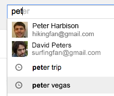
A recent post from Gmail's Google+ page mentioned 2 new Gmail search features: enhanced contact suggestions with thumbnails and suggestions from your Gmail search history.

"If you've searched your email for 'supercalifragilisticexpialidocious' or other lengthy phrases, it just got easier to find what you're looking for. Autocomplete predictions in Gmail may now include your past Gmail searches. Past searches as well as the new contact thumbnails shown below are rolling out to all Gmail users globally, including Google Apps for Business customers, over the next few days."


Are contact thumbnails in Gmail search a new feature? Not if you've previously joined the Gmail Field Trail, which adds many other cool features that integrate Gmail, Google Calendar, Google Drive and Google Search.

Updated Google Search Interface for Tablets

Google updated the search interface for tablets to make it look more like the desktop interface. There's now a "search tools" button that replaces the wrench button, "more" is a regular menu and the icons for specialized search engines have been removed.

Here's the new interface:


... and here's the old one (screenshot from October 2011, when Google tested this interface):


This is a much more recent screenshot: