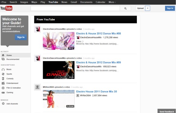
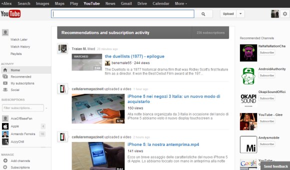
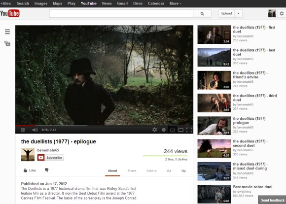
The upload button now has a drop-down that lets you go to the video manager and the analytics section, while the browse button has been removed. You can no longer go to the "inbox" from the homepage. When you click the button next to your Google Profile avatar (which is also new), YouTube sends you to the settings page, where there's a tab for the inbox.


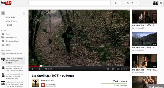
Video pages have a button that toggles the sidebar, so you can quickly access the feed, your subscriptions, the history and other sections without having to visit the homepage. It's interesting to notice that most YouTube sections have a consistent feed-like interface, whether they're displaying videos from your subscriptions, recommendations, playlists or your history.


Here's how you can try the new interface. If you use Chrome, Firefox, Opera, Safari or Internet Explorer 8+:
1. open youtube.com in a new tab
2. load your browser's developer console:
* Chrome - press Ctrl+Shift+J for Windows/Linux/ChromeOS or Command-Option-J for Mac
* Firefox - press Ctrl+Shift+K for Windows/Linux or Command-Option-K for Mac
* Opera - press Ctrl+Shift+I for Windows/Linux or Command-Option-I for Mac, then click "Console"
* Safari - check this article
* Internet Explorer - press F12 and select the "Console" tab.
3. paste the following code which changes a YouTube cookie:
document.cookie="VISITOR_INFO1_LIVE=vSPn-CmshUU; path=/; domain=.youtube.com";window.location.reload();4. press Enter and close the console.
You can also check the previous UI experiments for the homepage and "watch" pages.
Update (December 7, 2012): The new interface is available for everyone and you can no longer go back to the old layout.
{ Thanks, Pascal. }
No comments:
Post a Comment