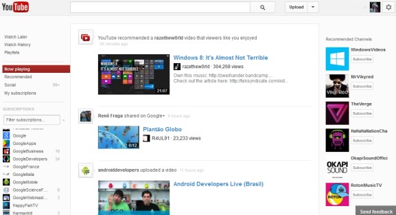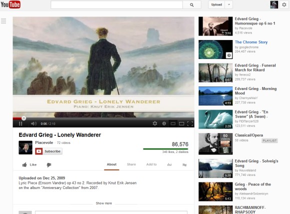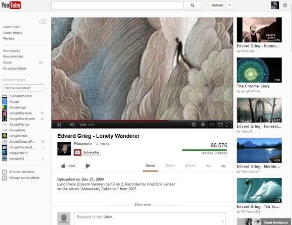
There are new icons for the "like"/"dislike" buttons, there's a new way to show the navigation sidebar and the "more from" section has been removed.


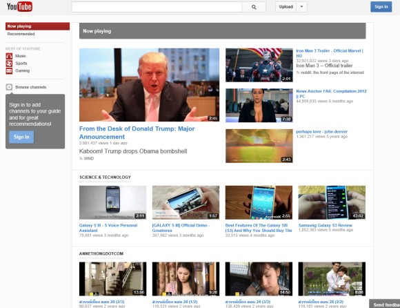
The homepage looks a lot different if you're not signed in. YouTube shows popular videos from topics like entertainment, sports, news, movies. The topic pages are automatically generated by YouTube.

You can check some screenshots from the previous YouTube experiment.
Here's how you can try the new interface. If you use Chrome, Firefox, Opera, Safari or Internet Explorer 8+:
1. open youtube.com in a new tab
2. load your browser's developer console:
* Chrome - press Ctrl+Shift+J for Windows/Linux/ChromeOS or Command-Option-J for Mac
* Firefox - press Ctrl+Shift+K for Windows/Linux or Command-Option-K for Mac
* Opera - press Ctrl+Shift+I for Windows/Linux or Command-Option-I for Mac, then click "Console"
* Safari - check this article
* Internet Explorer - press F12 and select the "Console" tab.
3. paste the following code which changes a YouTube cookie:
document.cookie="VISITOR_INFO1_LIVE=jZNC3DCddAk; path=/; domain=.youtube.com";window.location.reload();4. press Enter and close the console.
Update (December 7, 2012): The new interface is available for everyone and you can no longer go back to the old layout.
{ Thanks, Abhishek and Lukáš. }
No comments:
Post a Comment